 |
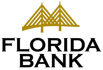
Florida BankUpdating the visual identity for Bank of St. Petersburg (which has now become Florida Bank) had to be subtle as not to upset the equity they had built with their brand for 20 years. By stylizing their bridge, they now have a symbol that is a metaphor for "A Bridge to Better Banking" and not just an illustration of a particular bridge, one that is streamlined and is easily reproduced for all their print materials, signage, and uniforms for their statewide chain of community banks and for their parent holding company Florida Bank Group, Inc. Identity presentation. |
 |
|
|
|